

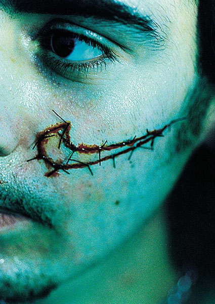
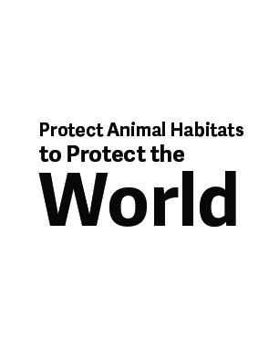
The final design of my impactful poster.
Prints for Social Good
Research
For this project's research, we focused on methods for creating impactful posters. We concentrated on shock, irony, coding, emotion, instruction and fact. All of these different methods help create an impact. We wanted to find at least one example of each type of these methods.
Shock

Irony

Coding

Emotion

Instruction

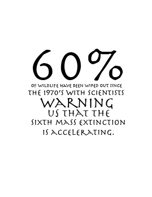
Fact
Explanation:
Project Proposal
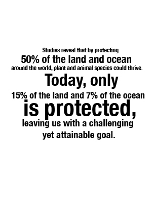
The topic that I want to choose for my social issue poster, I want to focus on climate change. More specifically, I want to focus on the full impact on animals, which is causing deforestation and pollution. I feel that it is so important to talk about how our interactions with the environment are affecting all of the ecosystems and animals in so many ways. There is no specific audience for this poster, but possibly those who respect animal habitats and have not thought about how their actions have been affecting all of the different species that we share the Earth with. I am planning to use emotion and focus on how each of these animals has been endangered and is close to extinction. I believe that emotion will be an effective method to pull on the humanity in individuals, and the idea that their actions are destroying entire animal families. I feel that shock could also be utilized for the poster if I wanted to go on the darker side of the destruction, as an example of the negative effects that we are having on the environment. I am not planning on using coding, instruction, or irony because I feel that these are not going to be very effective when it comes to the specific topic that I chose. I may utilize facts to put some of this information into perspective on how great impact that is occurring.
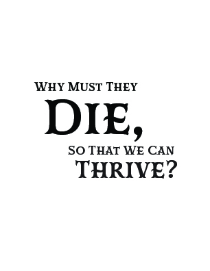
For my poster, I want to put an image of an animal that is endangered with the text "Why must they die so that we can thrive?" This text has a rhythm that will draw more people in, but it is also using strong language that will make people think about the impact that they are having on the animal with the image on the poster. I feel that I could also include a fact that is related to the animal on the poster as well, to include even more of an impact on the poster. Finally, I could also use shock if I wanted to use more graphic images of animals and the injuries that they have sustained from the actions of individuals, but that is not currently the direction that I am choosing to go. Ultimately, I am going to focus on climate change and its impact on animals while utilizing the methods of fact and emotion to connect with individuals and make them cause a change for the better for the benefit of the future of all of the different animals that are currently endangered.
Project Experimentation

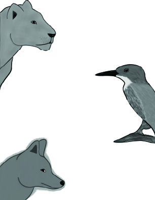
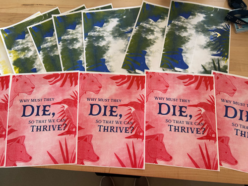
This is the first part of the assignment. In this first part, we were experimenting with the many different ways that the use of typography can create impact. We were meant to select four different types of impact to focus on. I chose the types of shock, instruction, fact, and emotion. I played around with the typographic lockup to determine if it would fit with the animal design. I created the animal design to be interesting and show the connection to animals, while also providing a large amount of space for the type to go once I determined which type of impact I wanted to use for my poster. Then we took these images onto the RISO printer, where we were able to play with colors and how the different color pairings would cause impact and cause the reader to feel connected to the poster.
Riso Experimentation
There was a lot of experimentation through this entire process. I played around with different color pairings and had some successes and some failures throughout the entire design process. Some of the prints were too dark or had a smudged texture, but after playing with the different settings, I was able to create a design that I enjoyed and that represented the image that I had in mind. Ultimately, even though this process took a long time and had quite a large learning curve, it was interesting to think about how colors could layer and interact to cause a visual interest.
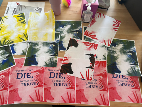
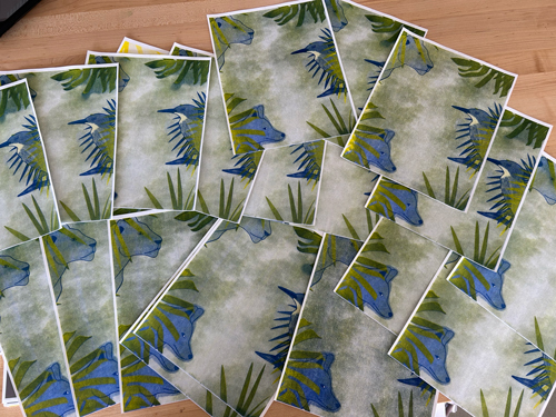
All of the different experiments that I conducted.

The full design process is separated into the different layers.
The final design of my impactful poster.
This final design pulls on shock with its message and some emotion. There is a large amount of contrast between the green and the red, and the blue color brings in a melancholy tonal quality. I feel that the message and the imagery work well to show the core message of how our actions are affecting animals' habitats and lives. Ultimately, I feel that this design is very effective at showing the core message of this poster.
Critique:
As a class, following our final designs, we had a critique. I got mostly positive feedback, but there were a few small aspects that I could change. They loved the layering of color and the effect that I could get with the RISO printer. The few things they critiqued were the possibility of having too much negative space in the bottom right corner and possibly making the message more connected. If I had the time to fix this, I would probably add a call to action or a QR code that has more information in the bottom right corner in the negative space. As for the message idea, I could show the hiding more and the idea that they are hiding from the viewers and humans because of the loss of their habitats and deaths. Ultimately, if I had more time, I would tweak only a few smaller things in response to their feedback.