
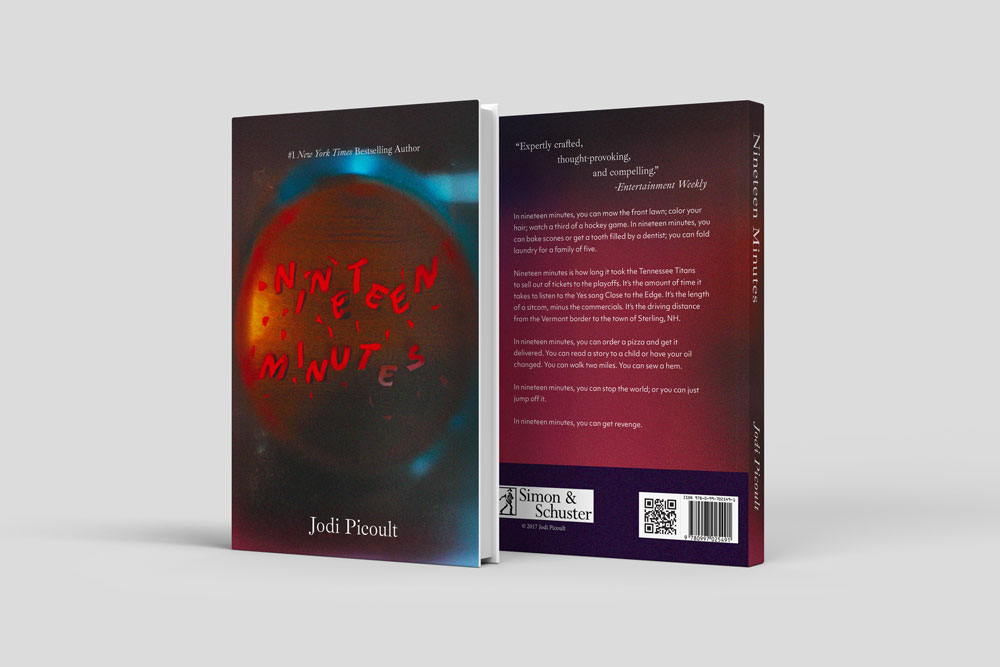
Final Mockup of the Book Cover of Nineteen Minutes for the Edible Book Fest.

Final Full Spread of the Book Cover of Nineteen Minutes for the Edible Book Fest.
2025 Edible Bookfest
Project Description
This project surrounds a fun and interactive festival for many individuals. It is a focus on building book covers with edible materials. For our class, we were going to use this idea but bring in something of graphic design. This project is made to create many different designs and ideas using many different physical materials and then digital tools to refine more of the details and information. This assignment is meant to be an interesting combination of experimentation and refinement.
Phase 1
The first phase of this project consisted of making a list of different verbs to be the possible inspiration for the other kinds of typefaces I would make. We then discussed all of the verbs that we had written. Once we had chosen a specific word to focus on, we then began to create a letter in that word using edible materials such as flour, rice, and ketchup. We wanted to try using different materials and mediums to see if we could embody the context of the word in the way that we chose to depict our letterform. I chose the word "deconstructed" and then focused most of my energy on the letter "D."
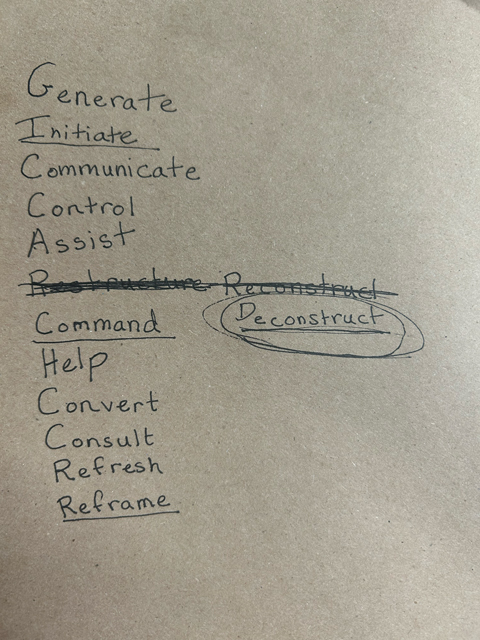
This is my list of possible verbs to use for my typography.
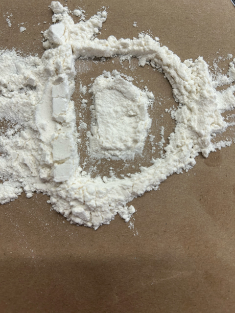
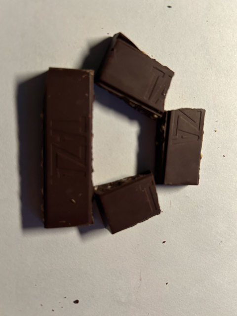
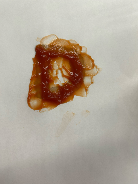
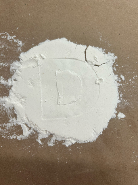


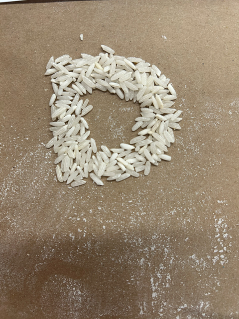


A few examples of my different experiments with edible mediums with the letter "D".
Phase 2
In this second phase, we were supposed to create many typographic experiments from inedible materials. I attempted to use many different materials in many different ways to create various letter forms. Following the construction of all of these experiments from Phase One and Phase Two, we talked in groups about our favorites and which experiments were the best to create. Then, after narrowing down the typographic styles, we were tasked with choosing a book that would complement the typographic style. We were then tasked with measuring the book's dimensions and making blank book jackets from the measurements that we got.


A few examples of my different experiments with inedible mediums.
 The book that I chose for the edible book cover festival.
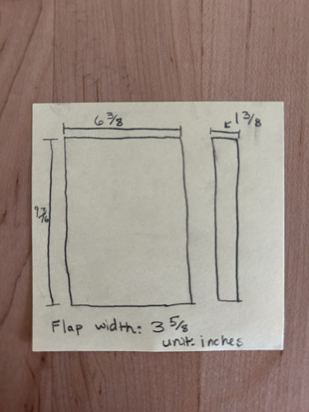 The dimensions of my chosen book cover.
 This is an image of the critique that was held during class.
Phase 3
The third phase of this project was to work with some of the techniques we had created into a full word or the title of our book. I used the jar to create an effect while using a crumpled texture and then a cut-up style. Then, once I received some critiques, I decided to go with the jar effect while adding more of an edible element. I decided to use cereal to make my typography because it plays a small part in the book. All in all, this phase was used to refine our ideas and give us the ability to refine the direction for the overall book cover.


These are some of the word experiments that I produced for the book title.
Phase 4
In this phase, the main focus was on creating and choosing a photo to be the basis of our book jacket. The idea was to choose an image that we thought embodied the elements of the book and we felt had a good connection. While we were trying to go for connection, we were also attempting to find an image with a type that was interesting and could be easily read because one large factor of typography is the ability to be legible while also portraying a message.

This is an image of the book cover I chose, with a little editing from Photoshop.
Reflection of Current Point/Reason for My Medium Choice
I originally started with materials that were strongly connected to the idea of edible materials. Some of these materials were orange peels, candy, and many more. However, there were quite a few limitations surrounding edible materials because of the size and structure of those mediums. So, I moved to sticky notes, which are bland, and now that they are edited, you cannot tell what the material is completely made of. Furthermore, I used a jar to create an effect that is linked with the idea of both edible materials in general and, more specifically, holding edible materials. By using sticky notes, I was able to get a more precise and clean typographic structure to help with the readability of the book title, and I feel that it does not detract from the theme of edible typography.
Phase 5/Final Design
In this final phase, we are working with the photos we took of our book titles in Photoshop. With Photoshop, we could refine and expand our image's background. We did this to make the size of the photo into the size and dimensions of the book cover that we measured in phase two. Due to the limitations of paper, I had to use a different book that would fit and give me enough space for all of the information. Once we finished all of the small refinements and got the background image ready, we took the image into InDesign. We used InDesign to place in the normative type, such as the author, back cover text, and the flap text. We then printed out copies of our book jackets to see if the typography had a good rag, spacing, and was completely cohesive. This is a repetitive process in design to ensure that there is improvement between versions and that it is in the best state when it is in the final version. We then held an exhibition in the library with a lot of work. There was a mix of edible elements and our designs, which showed a sense of the community on campus and allowed us to showcase our work to others.